Science is full of data. Students encounter graphs when they study weather patterns, ecosystems, forces and motion, matter, populations, engineering designs, and almost every other area of science. Learn how to Teach Students to Analyze Science Graphs
But simply showing students a graph does not mean they know how to analyze it.
Many students can locate a number on a graph but struggle when they are asked to identify a pattern, compare data, explain a trend, or use the graph as evidence for a scientific conclusion.
The good news is that science graph analysis is a skill that can be taught explicitly and practiced in just a few minutes at a time.
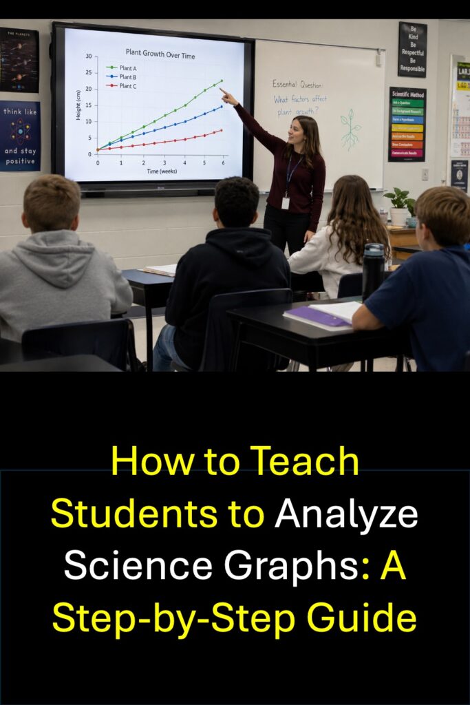
How Do You Teach Students to Analyze Science Graphs?
Students can learn to analyze science graphs by following a consistent process:
- Identify what the graph is showing.
- Read the title, axes, labels, and units.
- Look closely at the data.
- Identify patterns, trends, and relationships.
- Compare specific data points.
- Make a conclusion based on the data.
- Support the conclusion with evidence from the graph.
The key is teaching students to read the data before trying to explain the science behind it.
That small distinction can make a big difference.
Why Is Graph Analysis Important in Science?
Graphs allow scientists to organize data so patterns and relationships are easier to see.
Students need to be able to do more than create graphs. They also need to interpret them.
When students analyze science graphs, they practice:
- identifying patterns
- comparing quantities
- recognizing increases and decreases
- using units correctly
- noticing relationships between variables
- finding evidence in data
- making evidence-based conclusions
- communicating scientific reasoning
These skills are important during science investigations, but they are also useful when students encounter graphs on assessments, in informational texts, and in everyday life.
Graph analysis also creates a natural bridge between data analysis and Claim, Evidence, and Reasoning (CER).
Before students can use data as evidence, they have to understand what the data actually shows.
Step 1: Teach Students to Read the Graph Before the Questions
One of the most useful habits students can develop is surprisingly simple:
Look at the graph before reading the questions.
Students often jump immediately to the first question and start hunting for an answer. Instead, teach them to spend a few seconds examining the graph itself.
Have students ask:
- What is the title?
- What is being measured?
- What does the x-axis show?
- What does the y-axis show?
- What units are being used?
- Is there a key or legend?
- What type of graph is this?
This first look gives students context for everything that comes next.
For example, suppose students are looking at a line graph titled Average Daily Temperature Over Seven Days.
Before answering a single question, they should already recognize that:
- time is represented on one axis,
- temperature is represented on the other,
- the graph shows change over several days,
- and the units tell them how temperature was measured.
Students who understand the structure of the graph are much less likely to misinterpret the data.
Step 2: Have Students Describe the Data Before Explaining It
This is one of the most important steps in teaching science graph analysis.
Students often try to explain why something happened before they have accurately described what happened.
Start with observations.
Ask questions such as:
- Which value is highest?
- Which value is lowest?
- Where does the graph increase?
- Where does it decrease?
- Where does it stay approximately the same?
- Which two categories are most similar?
- Which categories are most different?
- What changed the most?
- What pattern do you notice?
At this stage, students should be able to answer directly from the graph.
There is no need to infer a scientific cause yet.
For example:
Observation: The plant receiving eight hours of light grew taller than the plant receiving two hours of light.
That statement describes the data.
Inference: The additional light caused the plant to grow taller.
That statement begins interpreting the science.
Students need to recognize the difference.
Step 3: Teach Students to Look for Patterns and Trends
Once students can accurately read individual data points, move beyond questions that ask them simply to locate information.
Ask students to identify patterns.
Common graph patterns include:
- increasing
- decreasing
- remaining stable
- increasing and then decreasing
- repeating or cycling
- showing a peak
- showing a low point
- showing a positive relationship
- showing a negative relationship
- showing little or no apparent relationship
Students don’t necessarily need advanced statistical vocabulary, especially in elementary grades. They do need to become comfortable describing what they see.
Instead of saying:
“The graph goes up.”
Encourage students to become more precise:
“As the amount of sunlight increased, plant growth also increased.”
That is a much stronger scientific observation.
Step 4: Ask Students to Compare Data
Comparing values is an excellent bridge between simple graph reading and deeper analysis.
Instead of only asking:
How many insects were observed in Habitat A?
also ask:
How many more insects were observed in Habitat A than in Habitat B?
Or:
Which two habitats had the most similar number of insects?
Or:
How did the population change between Week 1 and Week 4?
These questions require students to use more than one part of the graph.
This is important because real data analysis rarely involves looking at a single value in isolation.
Science Graph Analysis Skills by Grade Band
Students’ graph-analysis skills should become more sophisticated as they gain experience with data.
| Grade Band | Graph Analysis Skills to Emphasize | Example Questions |
|---|---|---|
| Grades 3–4 | Read titles and labels, identify values, compare categories, identify highest and lowest values, recognize simple increases and decreases | Which category has the greatest value? What happened to the temperature from Monday to Tuesday? |
| Grade 5 | Compare multiple data points, identify patterns, calculate simple differences, describe trends, connect observations to science concepts | What pattern do you notice as temperature increases? Which two groups show the greatest difference? |
| Grades 6–8 | Analyze trends, compare variables, recognize relationships, identify evidence, make conclusions, evaluate whether data supports a claim | What relationship exists between the two variables? Which evidence from the graph best supports the conclusion? |
The exact complexity will vary depending on the students, the science content, and the graph itself. The goal is to gradually move students from finding information to interpreting information.
Step 5: Move From “What Does the Graph Show?” to “What Does the Data Mean?”
Once students can describe the data accurately, begin asking interpretation questions.
For example, imagine a graph showing the number of pollinators visiting several types of flowers.
A basic graph-reading question might ask:
Which flower received the most pollinator visits?
A more analytical question might ask:
What conclusion can you make about pollinator visits based on the data?
And a deeper question might ask:
Which evidence from the graph best supports the conclusion that pollinators visited some flower types more frequently than others?
Notice the progression:
Find the data → identify the pattern → interpret the pattern → support a conclusion.
That progression is at the heart of strong science data analysis.
Step 6: Require Students to Use Evidence From the Graph
One of the best questions you can ask after students analyze a graph is:
What evidence from the graph supports your answer?
Students sometimes make perfectly reasonable scientific statements that are not actually supported by the data they were given.
For example, suppose a graph shows that a particular bird population decreased over five years.
A student might say:
The population decreased because its habitat was destroyed.
That may be scientifically possible, but unless the graph provides information about habitat loss, the student does not have evidence for that explanation.
A stronger response would be:
The bird population decreased from 240 birds in Year 1 to 160 birds in Year 5.
Now the student is using evidence.
This habit prepares students naturally for Claim, Evidence, and Reasoning.
Step 7: Connect Graph Analysis to CER
Graphs are one of my favorite ways to help students understand the Evidence portion of Claim, Evidence, and Reasoning.
Students often understand how to make a claim but aren’t sure what counts as evidence.
A graph makes the evidence visible.
For example:
Claim: Increasing the amount of light increased plant growth.
Evidence: The plants receiving eight hours of light grew an average of 14 cm, while the plants receiving two hours of light grew an average of 5 cm.
Reasoning: Plants use light during photosynthesis, which allows them to produce the materials needed for growth.
Notice that the evidence comes directly from the data.
When students practice analyzing graphs regularly, they become much more comfortable locating specific evidence for scientific arguments.
Step 8: Use Different Types of Science Graphs
Students need experience with more than one graph format.
Depending on grade level, include opportunities to analyze:
Bar Graphs
Bar graphs are useful for comparing categories.
Science examples might include:
- animal populations in different habitats
- mass of different objects
- rainfall in several locations
- plant growth under different conditions
Line Graphs
Line graphs are especially useful for showing change over time or another continuous variable.
Science examples might include:
- temperature throughout a day
- population changes over several years
- distance traveled over time
- water temperature during heating
Data Tables
Don’t overlook tables.
Students need to be able to read organized numerical data even when it has not been converted into a graph.
You can also have students compare a data table with a graph showing the same information.
More Complex Graphs
Middle school students can gradually work with:
- graphs containing multiple data sets
- graphs with legends
- scatterplots
- graphs comparing two variables
- graphs showing experimental results
The goal isn’t to make graphs complicated simply for the sake of difficulty. It is to help students become flexible when data is presented in different ways.
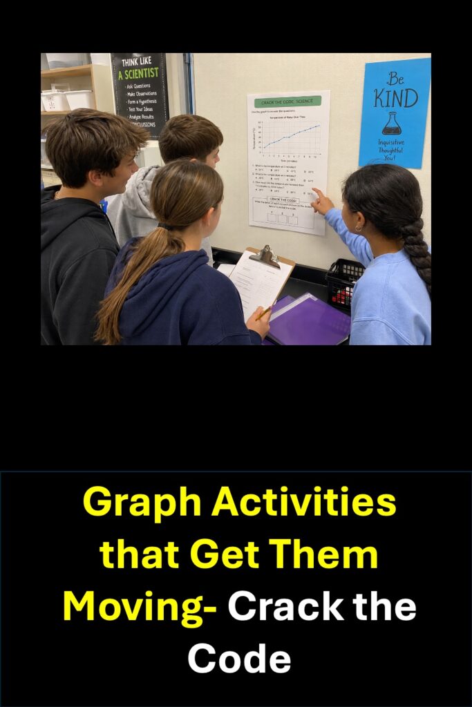
Step 9: Use Science Content Students Are Already Learning
Graph analysis does not have to be taught as a separate unit.
In fact, it is often more meaningful when students analyze data connected to the science they are already studying.
For example:
Life Science
Students can analyze graphs involving:
- ecosystems
- populations
- food webs
- plant growth
- biodiversity
- inheritance
- environmental changes
Earth and Space Science
Students can analyze:
- weather data
- precipitation
- temperature
- climate patterns
- moon observations
- daylight hours
- earthquake data
Physical Science
Students can analyze:
- motion
- force
- energy
- temperature
- changes in matter
- mass and volume
Engineering
Students can compare:
- design performance
- material strength
- cost
- efficiency
- test results
- different solution criteria
Now students are practicing two skills at once: understanding science content and interpreting scientific data.
Step 10: Give Students Frequent, Short Graph Practice
Students don’t necessarily need a 45-minute graphing lesson every time they practice analyzing data.
Five focused minutes can be extremely effective.
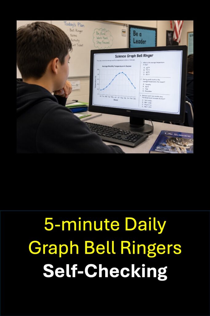
This is one reason I like using science graph bell ringers.
Students can examine one graph and answer a few carefully selected questions at the beginning of class.
A short graph activity might ask students to:
- identify a value,
- compare two values,
- identify a pattern,
- make a conclusion.
Over time, those few minutes add up to a tremendous amount of graph-reading experience.
Frequent practice can also make data analysis feel like a normal part of science rather than something students only encounter during a test.
How to Teach Students to Analyze Science Graphs
What Questions Should You Ask About a Science Graph?
A good set of graph-analysis questions should include different levels of thinking.
Try combining questions like these:
Reading the Graph
- What does the x-axis represent?
- What does the y-axis represent?
- What is the highest value?
- Which category has the lowest value?
Comparing Data
- Which two values are most similar?
- How much greater is one value than another?
- Which category changed the most?
Identifying Patterns
- What trend does the graph show?
- What happens as one variable increases?
- During which interval did the greatest change occur?
Making Conclusions
- Which conclusion is best supported by the graph?
- What does the data suggest?
- Which statement accurately describes the relationship shown?
Using Evidence
- Which data point best supports the claim?
- What evidence from the graph supports your conclusion?
- Which statement is supported by the data?
A strong science graph activity should not consist entirely of questions that ask students to locate individual numbers.
Students need opportunities to think about what those numbers mean.
What Are Common Mistakes Students Make When Reading Science Graphs?
Several problems appear again and again.
Ignoring the Units
A student may correctly read “20” without noticing whether the graph represents:
- 20 grams,
- 20 centimeters,
- 20 degrees,
- 20 seconds,
- or 20 organisms.
Teach students to include units whenever they discuss quantitative data.
Reading Only One Data Point
Students sometimes find one number and immediately choose an answer.
Encourage them to look at the entire graph before answering.
Confusing Observation With Explanation
Students may add background knowledge that isn’t supported by the graph.
Remind them:
What do you know from the data?
Then:
What can you infer from the data?
Overlooking the Scale
Not every graph increases by ones.
Students need practice reading axes that count by:
- 2s
- 5s
- 10s
- decimals
- percentages
- larger intervals
Giving Vague Answers
“The line goes up” is a beginning.
“As time increased, the distance traveled increased” communicates the relationship much more clearly.
How Can You Teach Graph Analysis Without Adding More Grading?
Graph practice does not always need to become an assignment you collect.
Students can:
- discuss answers with a partner
- respond on mini whiteboards
- vote on multiple-choice answers
- explain which answer they chose
- compare reasoning with a partner
- complete a graph as a bell ringer
- use the data during a CER discussion
- correct an answer together as a class
The goal is practice.
Not every useful science activity needs to create another stack of papers to grade.
How Do Graph Bell Ringers Help Students Analyze Data?
Graph bell ringers provide repeated exposure to scientific data in manageable amounts.
Instead of asking students to master graph analysis during one unit, students can practice throughout the year.
A well-designed graph bell ringer gives students repeated opportunities to:
- read graph titles and labels
- interpret axes and units
- compare data
- identify patterns
- recognize relationships
- make conclusions
- use evidence
I create my Science Graph Bell Ringers around this idea: short, consistent practice with meaningful science data.
Students can work with graphs connected to life science, Earth and space science, physical science, engineering, and grade-level or state-specific science content.
What Is the Best Way to Improve Science Graph Analysis Skills?
The best way to improve students’ science graph-analysis skills is to teach a repeatable process and give students frequent opportunities to use it with different types of scientific data.
Teach students to ask:
1. What is this graph showing?
2. What do the axes and units tell me?
3. What do I notice in the data?
4. What patterns or comparisons can I identify?
5. What conclusion is supported by the data?
6. What evidence from the graph supports that conclusion?
When students use this process repeatedly, graph analysis becomes less intimidating.
They begin to see graphs not as complicated pictures filled with numbers, but as another way scientists communicate information.
And that is ultimately the goal.
We don’t just want students who can answer a graph question on a test.
We want students who can look at data, understand what it shows, ask good questions, identify evidence, and make sense of the world around them.
About Lynda R. Williams
Lynda R. Williams is a science educator with more than 34 years of experience in education and a Master’s degree in Curriculum and Instruction. She taught Science Methods in university Professional Teacher Education Programs for 20 years and specializes in practical, standards-aligned science instruction for grades 3–8.
Through Teaching Science with Lynda R. Williams, she creates science resources designed to help teachers give students meaningful practice with science concepts, data analysis, graph interpretation, CER, and scientific reasoning.